top of page

Kiva:
Small Business
Campaign
Role:
Brand Identity
UI/UX - website
Packaging
Copywriting
" Altitude Grown...
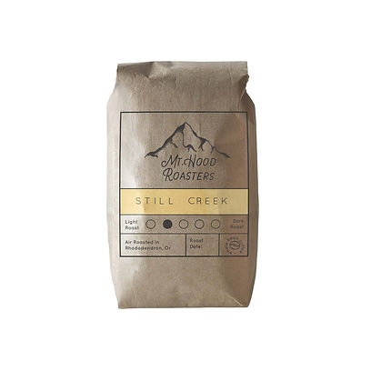
For this rebrand, I wanted to express the company's authentic, traditional, and charming qualities through a handmade design. I took inspiration from the companies family-owned coffee shop and its woodsy surroundings.
Mt. Hood Roasters' primary logo is a wordmark and icon. The main lettering style has a playful, hand-drawn quality that helps emphasize the hand- made and personal values of the brand. The Shapes of the letters mimic those seen on a mountain. The mountain illustration is a key feature for making the brand recognizable and memorable.


bottom of page
